Freehands: A Guide to Slow and Inefficient Brush Painting of Tiny Tanks (part 2)
This is the second part of the series dedicated to slow and inefficient (quite fun though) brush painting of tiny 1/100 scale tanks. In the first part we set up a foundation for the colour modulation effect. This time we are going to talk a little about painting tactical markings and doing freehands on miniatures in general.
It is hard to overstate how much of an impact markings can make on appearance of a model tank. Designed to contrast with the main colours of the vehicle, they can turn a green brick on tracks into an eye-catcher. Even simplest markings, such as numbers, radically change the look of the model. Not only they spice up the model's appearance with another texture (font), they also guarantee that viewers will pay more attention to your piece as human eye is well trained to recognise writing, especially numbers, and very few things can prevent it from doing so automatically. More complex markings can include interesting shapes or even bright colours such as yellow or red, which can potentially make models more attractive and interesting.
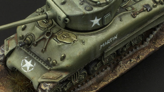 |
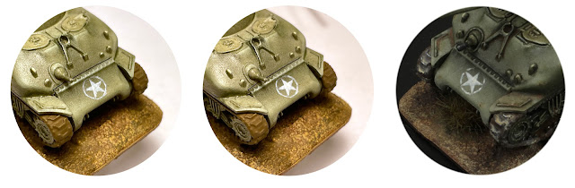
| 1/100 Sherman from Plastic Soldier Company. The freehands are not extremely complex or neat but they add a ton of character to the model. |
When it comes to markings (and brush painting) there are two major ways a modeller can go: decals or freehands. This post is dedicated to the latter, and before we start, let's see why one might want to choose this way over the other.
Why Bother With Freehands?
Most of the model kits available on the market include decal sheets, for the rest there are numerous aftermarket options. Decals nowadays feature mind-blowing quality and detail that would be impossible to recreate with a brush. Finally there is a variety of solutions to help you set your decals correctly and smoothly, frankly applying decals have never been easier. However easy solutions is not exactly what this guide is about. Below you will find a couple of reasons why I think freehand may be worth the effort.
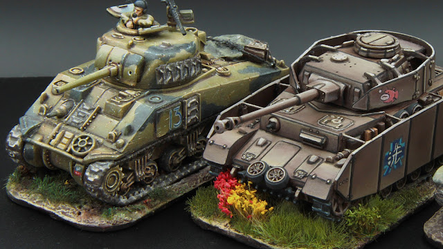 |
| 1/100 tanks from Plastic Soldier Company. Left: Sherman from 4th New Zealand Armoured Brigade. The freehanded emblem only vaguely resembles the original, but it is still recognisable and also adds that much needed bright spot. Right: Anglerfish Team Panzer IV from Girls Und Panzer. One of the most challenging freehands I have done so far: both complex and very fine. |
Unique Shapes A very specific tactical number or font, dimensions that will fit perfectly on to the armour plate of your choice - sometimes the perfect decal simply doesn't exist. But if we decide to go the freehand way - anything is possible. Designing and painting own markings is a cherry on top which makes the model truly personal.
Unique Finish Because freehands assume painting, all of the tricks we use on the rest of the model are still available to us. We can make our markings semi-transparent (if they are hand painted and worn out) or opaque, apply shadows and highlights (to simulate some special finish), chipping, lining and much more - all to make them fit better into the overall concept.
Coolness Maybe it is just me and the environment I grew up as a painter in, but freehands, on par with Non-Metallic Metals, seem to be universally acknowledged as something very cool in miniature painting. So if we want to add a bit of a wow-effect to our model, or just walk this extra mile and then feel proud about our work - freehands are the way to go.
Practice While freehands, at least the ones we are talking about here, are not much of a rocket science, they still require a number of different technical and artistic skills. And because working on freehands is a lot of fun it is also one of the best ways to raise the level of your painting.
I hope I convinced you at least a little bit and you will proceed with reading this post. By the way, if you paint (or want to paint) freehands for a different reason - let me know, I am curious!
In these posts I mostly talk about my own approaches, surely your process may differ, feel free to come up with your own workflow, just remember to keep it fun!
So how do we approach freehands, where do we start? First we need to come up with the design itself...
Finding the design
It is always a good idea to use reference materials while looking for markings to apply to your model. Mainly because they allow you to better imagine what your model is going to look like. I recommend taking your time and searching for diverse and reliable materials. This will pay off in a form of an enjoyable research and an authentic-looking model. I would rank different materials I encountered from most to least reliable as follows:
- Photos from the actual period of service (or right after);
- Albums and compendiums from the country of origin of the vehicle;
- Other albums and compendiums, photos of museum vehicles;
- Wargaming oriented publications;
- Photos of models made by other hobbyists;
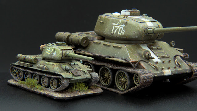 |
| Numbers painted on 1/100 and 1/56 scale T-34-85s. In both cases they give an anchor for viewers' eye to stick to. Graphical elements such as the triangle, arrow and "racing" stripe keep the viewer entertained. Both marking schemes were found through researching historical photos. The "Л-170а" tank seems to be quite famous and popular among modellers. |
A note on fiction All said above doesn’t imply you cannot come up with your own markings, for example for a what-if or a sci-fi model. Still, even in this case, real-world references can help you better understand what kind of markings is going to look good, sensible and believable in your universe. Are they applied by people or machines? What tools are used for it? In which situations do they help identify the vehicle: on the battlefield or on the march? What do they mean? Having these questions answered, try finding real-world markings of similar utility. They will give you hints on how to design and where to place your markings.
In order to make the model pop, your freehand doesn't have to be very complex. A large, well placed number can be no less (and quite often even more) effective than an elaborate emblem. Remember that when we are working in a very small scale (e.g. in case of 1/100 tanks) overly complex markings may lack definition compared to something more straightforward. Find something visually appealing and reasonably large. After you have the idea in mind it is time to "learn" the shape.
Learning the Shape
This step is about preparation and it is very important. I strongly recommend practicing your freehands on paper with a pencil before applying them to the model. This will make you feel more confident during the application, which is definitely going to result in better looking markings. Also if you are new to freehands and don't know how to approach them, with the preparation routine shown below you should be able to overcome this initial block.
Regardless of what your design is: a number, an emblem or a pattern -- the three following sub-steps should help you understand how to paint it. They are: understanding the proportions, decomposition and planning.
Understanding the Proportions
What can often happen while painting markings without preparation, is that they come out not exactly as we want them to be: smaller, bigger or warped somehow. In order to prevent this we need to define what is the bounding figure of our design. For example in case of a number it is a rectangle and for an allied star it is a circle. But it can be an oval or a triangle, anything. If the bounding figure of your design is complex, I recommend figuring out what would be a simpler bounding shape. E.g. if your marking has an oval shape or a shape of an arrow -- bound it with a rectangle.
Once you have your bounding shape sorted, understand which proportions it should have, so that the marking inside of it looks correct. Try sketching a couple of such shapes on a piece of paper in different sizes, but make sure that the proportions are constant. Being able to draw the same bounding shape in different sizes will help us fit the design snugly on to the vehicle later in the process.
We have the bounding shape, this is our canvas, it is time to fill it with stuff.
Decomposition
On this step we try to split our design into parts that are easier to paint separately and figure out what are their proportions and special features. To a degree the process resembles the previous step, but now applied to every element of the design. Still I'd like to give you a couple of pointers on what to look at for different types of elements.
Numbers and Letters Do all of the symbols have the same width? If not, what are the proportions? E.g. are "M"s 1,5 times wider than "A"s? Figure out the same about the heights. Finally pay close attention to the relation of the shapes that constitute every letter (e.g. do "B"s have two identical bellies each? If not, how much one is bigger?).
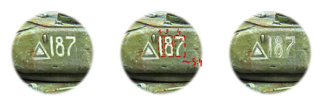 |
| Decomposition process of a number. The bounding box has approximate proportions of 5 to 4. Every digit has its own width. The thinnest is "1" which dictates the width of every line and also distance between the characters. "8" is about three times wider than "1", "7" four times wider than "1". The "8"'s upper ring's diameter corresponds to the lower one as 2 to 3. When painting the "7" take a look at the peculiar combination of angles and curves. The Right picture shows my guides and preliminary layers of paint. |
Patterns and Emblems Here it is important to break your design down into simple shapes, to later be able to reconstruct the whole image on your model. Again, pay attention to own and relative proportions of the shapes as well as to their relative positions (the easiest way is to think in terms of distances between the centres of the shapes). And if you are working with a pattern, figure out its period, meaning the smallest part of the design (the tile) which repeated creates the look you are after.
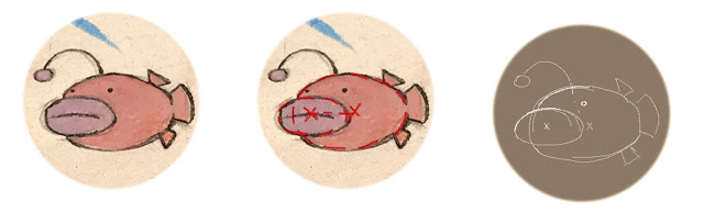 |
| Decomposition of the fish emblem. Its core is two ellipses. The biggest part of the small one is inside of the bigger one. The "mouth" ellipse does't touch the centre of the bigger one, but is pretty close to it. Once these two are placed, it is quite easy to mark other details. |
At this point we have our design lying in pieces before us. What is left is to practice "assembling" it before applying it on to the model. This is what the last step is about.
Planning
While the two previous steps were more about visual analysis and marking various details in our design of choice down, on this stage we are going to actively practice its application. First by drawing, then, if needed, by painting on paper or a spare piece of plastic.
After this stage it should be more or less clear how to approach your freehand, still there is a couple of last encouragements and recommendations for you in the next section.
Painting the Freehand
Even if it was daunting before - this time it is going to be much easier to approach your freehand. Start by doing almost exactly what you have practiced - sketch the freehand with a pencil right on the model. Do not get into too much detail, apply only most important bounding boxes and guiding shapes. Don't worry, almost like from paper, you will be able to erase it from the surface of your model, the remains will be painted over or stay to look like nice subtle weathering (from my experience on 1/100 models it is not a big deal).
Once you have your guides in pencil it is time to start fleshing out the design with paint. The right milk-like consistency is key. Understandably such gastronomical analogies do not work for everyone, so here are important qualities your paint should have:
- It needs to leave brush easily, even with a slightest touch. Add some water if your paint is too thick;
- It cannot be runny. After you put a brush stroke down it should preserve its shape. It should be a stroke, not a puddle. Add some more paint to the mix if it is too runny;
- It needs to be semi-transparent. We are always taught that two-three semi-transparent coats of paint are better than one thick layer, apparently this is true for freehands as well. Thin layers allow us to iteratively refine our freehand and bring it to the desired look step by step;
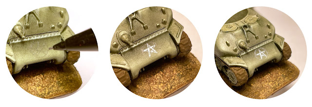 |
| Left: the guides applied with a pencil. Middle: first layer of thin paint. It is not very neat and also quite see through. We use it to gradually make the subsequent layers tidier. Right: first layer - continuation. Paint applied to the guide circle around the star. |
 |
| Left: more layers of the off-white applied, the design looks more solid now. Middle: neat touches of pure white applied to make the shape sharper. Usually with those you don't actually need to fix errors of the previous steps. Right: on the finished model I decided to separate the star from the circle with touches of olive drab (a bit too dark to my taste). |

Very brave. Freehand is really hard. Done some in the past, but nowadays decals make life so much easier. Still, stunning job. Well done.
ReplyDeleteThank you very much, Ashley!
DeleteFreehands are indeed not easy. But I really enjoy working on them and want to share the fun with other hobbyists. And maybe encourage someone to try doing one.